To get the data into R as a data frame, click on the file name above to load a local copy, and then do the following:
To look at these data, it is easier to attach the data frame. As you will recall from R for Ecologists, attaching a dataframe allows us to eliminate the dataframe name and field specifier "$" when using a specific field in the data frame.
Note from Jim: you'll need to delete some of the rows that contain spurious characters. You can do this by finding the row and then using: site=site[-14,] where 14 is the row to be deleted.
Let's look at the ECDF distributions of the continuous site variables first.
The "plot()" command below needs a second parameter for the values in the other axis of the scatter plot. A sequence with the same number of rows works (i.e. 1:156]). You can get the length of the "elev" row with "length()".
Also, the "lines()" function does not appear to draw but "segments(min(elev),1,max(elev),156)" will work where 156 is the number of rows in elev.
plot(sort(elev))                     # to see elevation distribution

lines(c(1,160),range(elev),col=2)    # to overlay a straight line of perfect

                                     # distribution
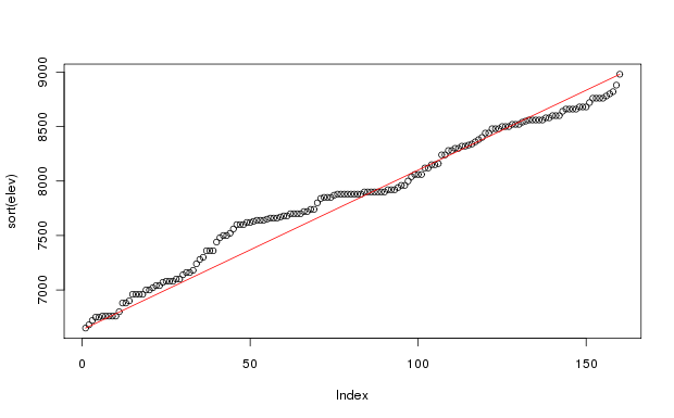
As you can see, the elevations of the sample plots are fairly uniformly spread from 6650 feet to 8980 feet (2027 to 2737 m). (Calculate elevm <- elev * 0.3048 to convert feet to meters). There are a few too few sample plots below 8000 feet, but the sample stratification took into account the variability of the vegetation by elevation, and lower elevations required fewer plots to represent them sufficiently. The
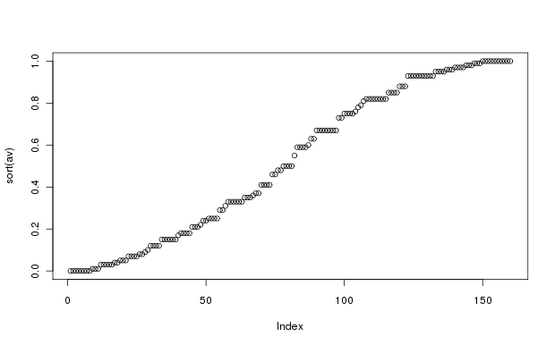
The distribution of aspect values shows a slight sine wave configuration. This is to be expected; the actual aspects are almost perfectly uniformly distributed from 0 to 360 degrees, so that the cos conversion results in the slight wave-like distribution. Aspect value is a very simple attempt to convert aspect in degrees from a circular variable to a linear (or at least monotonic) variable representing "coolness" that is suitable for statistical analysis. As explained in Roberts and Cooper (1989), the cos transformation is to convert aspect into solar radiation equivalents, and the correction of 30 degrees reflects the relative heat of the atmosphere at the time the peak radiation is received. Accordingly, the maximum value of av (=1.0) occurs at 30 degrees aspect, and the minimum (=0.0) at 210 degrees aspect. Of course, actual radiation loads are determined by latitude and slope as well as aspect, so the representation is over simplified.
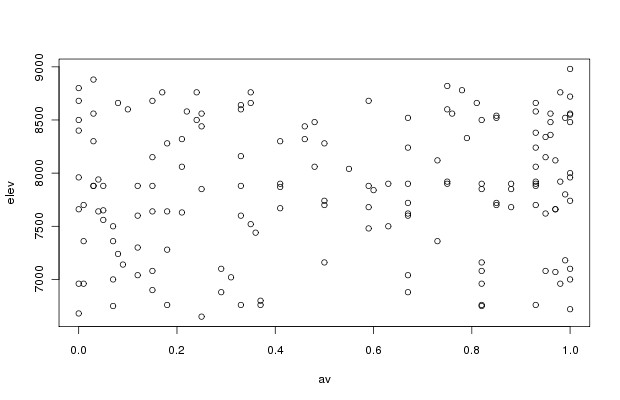
The joint distribution of elevation and aspect values is pretty good, and we should be able to employ both variables in analyses without worrying about correlation problems. If desired, the actual correlation can be tested easily.
Note: cor() computes a Kendall (parametric) or Spearman's (non-parametric) test where the output is 0 for no correlation and 1 for perfect correlation.
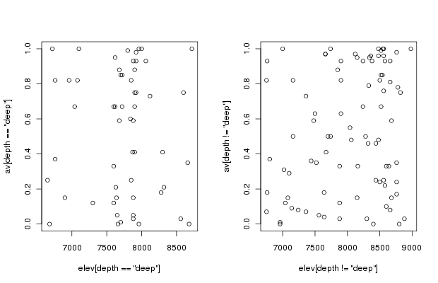
plot(elev[depth=='deep'],av[depth=='deep'])  # to see the joint distribution

                                             # on deep soil


plot(elev[depth!='deep'],av[depth!='deep'])  # to see the joint distribution

                                             # on shallow soil
Alternatively, numerous small panels get difficult to read, and a good alternative is the box plot.
boxplot(elev~depth)   # produces a simple visualization of elevation

                      # by soil depth
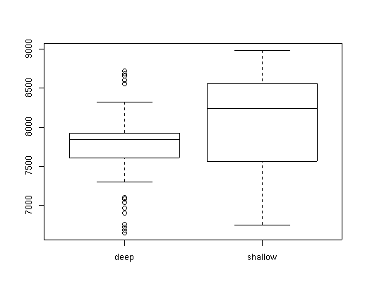
The syntax of the boxplot() function is interesting, and is something we'll see often in other contexts. The ~ character is R for "as a function of" so that boxplot(elev~depth) means plot elev as a function of depth. The boxplot will plot one box for each possible value of depth, which in this case is only two. Later on we'll see many examples of ~ meaning "as a function of."
I did not get the t-test below to work with this dataset and stopped here.
Often the simple boxplot is enough to warn us that the distribution of one variable is related to another, but we can easily check for independence with a t-test.
        Welch Modified Two-Sample t-Test


data:  elev[depth == "deep"] and elev[depth != "deep"]

t = -3.0848, df = 135.07, p-value = 0.0025

alternative hypothesis: true difference in means is not equal to 0

95 percent confidence interval:

 -482.4255 -105.5039

sample estimates:

 mean of x mean of y

  7731.429  8025.393
For the nominal (categorical) data we are pretty much limited to table output. We can look at the number of plots on each class easily, for example:
table(pos) to see the distribution of topographic positions:
 bottom low_slope mid_slope ridge up_slope

     20        33        54    18       35
          deep shallow

   bottom   13       6

low_slope   14      14

mid_slope   18      31

    ridge    5      12

 up_slope    6      26
A little later we'll be analyzing the distribution of species or vegetation composition as a function of environmental variability. Some of these analyses will be sensitive to the degree of correlation or independence among our environmental explanatory variables. For now, we can evaluate the dependence among categorical variables using a function called tabletest(). Simply cut and paste the function into your session:
tabletest <- function(x, y) { tmp1 <- table(x, y) tmp2 <- loglin(tmp1, list(1, 2), fit = T) list(dep = (tmp1 - tmp2$fit)/tmp2$fit, p = (1 - pchisq(tmp2$pearson, tmp2$df))) } tabletest() requires as arguments the two variables to be compared. For example,tabletest(pos,depth)For now, ignore the first line of output about iterations and deviation. The primary outputs of interest are $dep and $p. The first is a table of relative deviations from expectation, i.e. (obs-exp)/exp. This table shows, for example, that there were many more plots on deep soils and bottoms than expected, while deep soils on up_slopes were much less common than expected. The $p gives the Chi-square statistic for deviations from expectation, given the appropriate degrees of freedom.2 iterations: deviation 7.62939e-06 $dep: deep shallow bottom 0.77161640 -0.48551151 low_slope 0.29464275 -0.18539317 mid_slope -0.04883387 0.03072694 ridge -0.23844546 0.15003318 up_slope -0.51450896 0.32373613 $p: [1] 0.00546281Obviously, soil depth and topographic position are not independent in our data set, and we will have to be careful about attributing effects to one without accounting for the other.
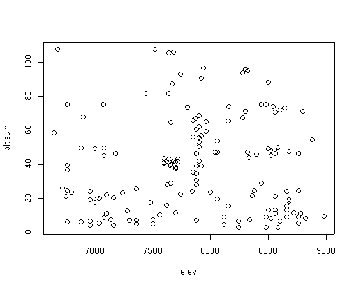
Let's look at the distribution of vegetation on the environment.
plot(elev,plt.sum) # to see if total cover varies as a function of elevation
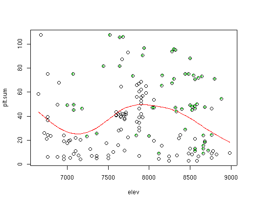
To anticipate a future lab (Lab 5), we can fit a line (shown in red) to the plot cover data as a function of elevation as follows:
lines(sort(elev),fitted(gam(plt.sum~s(elev)))[order(elev)],col=2)I won't attempt to explain all of that line in this lab, but it is a plot of a Generalized Additive Model (GAM) fit of plot cover to elevation. It's significant (P<0.001), but not terribly strong (pseudo R^2 = 0.13). We can highlight specific sample plots in the figure as follows:
points(elev[cover[,3]>2],plt.sum[cover[,3]>2],pch="+",col=3)to see the distribution of sites where species 3 has more than 2 percent cover superimposed on the previous graph.
By varying the size of the plotted symbol, we can add dimensions to the plotted data easily. For example, the plot below has elev on the X axis, av on the Y axis, and slope plotted in different sized symbols by quartiles.
plot(elev,av,type='n') # plot with no symbols type='n') points(elev[slope<2],av[slope<2],pch=16,cex=0.75) # plot the first quartile in small symbols points(elev[slope>=2&slope<3],av[slope>=2&slope<3],pch=16,cex=1.5) # plot the second quartile slightly larger points(elev[slope>=3&slope<5],av[slope>=3&slope<5],pch=16,cex=2) # third quartile larger yet points(elev[slope>=5],av[slope>=5],pch=16,cex=3) # last quartile largest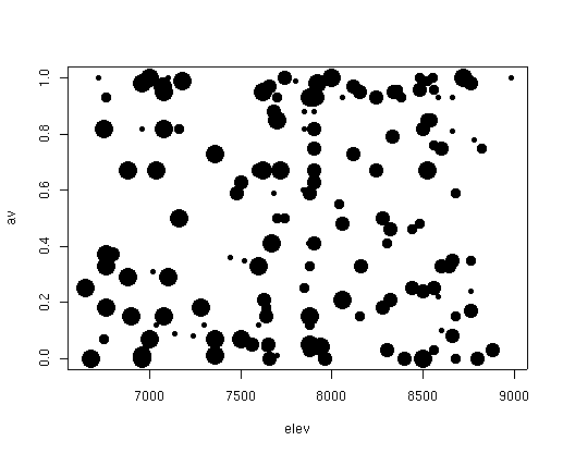
We can certainly make more creative and informative graphs by combining colors with sizes and shapes of plotting characters, but I'll leave that for now and introduce new graphics as the need arises.
Let's move on to Lab 3.